Group 6.png

Peacock Lil' Fixes

Hey there, Here you can find a write up of some updates to Peacock that I worked on and of course you can pop open the Peacock app to see my work in action. I am a product designer on the Viewing Experience team where we create new features and enhancements across all devices client wide. Whether its 10ft away from a big ole’ TV or in the palm of your hand, the Viewing Experience team is all over it!


Case 1

Availability Tile Badging

From ui design system to editorial asap

Problem: As the library of content grows, the browse tile experience is becoming more and more complex. New shows and movies are frequently badged with stark white or black “New Episodes Weekly” or “Streaming Only on Peacock” banners by the editorial team who are forced to burn these banners into key art. The banners themselves also tend to clutter the frame, appear outdated and no longer fit the brand.

Goal: Design dynamic availability badges for browse tiles UI that look modern and fit the brand.

Banner Mania

Bright white banners everywhere!

Clashing with art & editorial headaches


Competitive Audit

Peacock is still a new company and as such many of these simple sounding requests are actually tied up in many other aspects of the app that need to be accounted for. Even though the original ticket is only focused on browse tiles, I make sure to do a full audit of availability badging across the board to keep my team informed of how this work will cascade down to future tickets.


Define & Ideate

Unique to Peacock (at the time… streaming services iterate quick!) is our browse tile focus state, which surfaces metadata over a gradient layer. This ticket was left a bit vague and so it is important that I help define the goal and sync up with the Product Manager to discuss.

There are quite a few constraints already in place for our browse tile UI and its up to me and the PM to align so we can get input for tech.

Ideating on the fly, my PM and I agree that the lowest level of effort and highest level of impact would be a repurposing of existing coded badges. We confirm with tech and await their best guess on a timeframe for this kind of change to the client.

Unfortunately, techs timeframe does not align with business needs. Business needs the badges to be updated ASAP!

Knowing when to fight for a design and when to re-think a solution is part of every ticket I pick up. Even though a dynamic UI is ideal, I decide it is better to keep it in my back pocket and go for the fastest solution.

After discussing with my PM and with Design Team leadership - it is agreed that for the moment, these badges must remain burned in by the Editorial Team.

It’s a bummer, but the ideal solution is in the backlog and eventually will makes its way to production and hey on the bright side, now we don’t need to worry about scaling for smaller screens.

So with that, I begin ideating with burned in badges looking at pro’s and con’s.

I put together a few examples super fast in situation and present them to my team. Leadership is liking the approach however the VP likes the banner treatment. This project is now becoming more of a UI design change to the existing burned in banners, so I call in my homie Emma who has a background as a UI designer at a design agency! Together we blast through ideas.

A day or so later, we present our ideas to the team. Emma and I talk about our rationale for each visual design. Some have ties to brand marketing design and some have ties 2.0 UI that is in the pipeline but I am most in favor of a glassmorphism design since it will help dampen the loud tone of the stark white (or any color really) banner and help alleviate the noise on our browse page. My team and leadership agree however head of product still wants a loud design for exclusive content and loves the yellow gradient from one of our previous iterations. :P

Ron at accessibility has concerns I make sure that we stay in the green with accessibility.


Delivery

With design wrapped, I reach out to the editorial team to snag their PSD file and put myself in the shoes of an editorial employee badging key art. The last thing I want to do is make their jobs more complicated so Emma and I create a new PSD file that matches their current user flow.

In total, this project took about two weeks!


Case 2

Upcoming PDP

Problem: Content coming soon to Peacock does not have a PDP. Tech has built a makeshift workaround PDP but needs proper design. Designs for Upcoming PDP need to be ready ASAP.

Goal: Design an upcoming PDP page across all devices! Quick!


Competitive Audit

So whats out there? Let’s have a look.

As usual there are many complexities around this ticket. Our competitors provide the user appropriate information in a variety of places and in a variety of ways but all use some sort of unique navigation and availability badging.

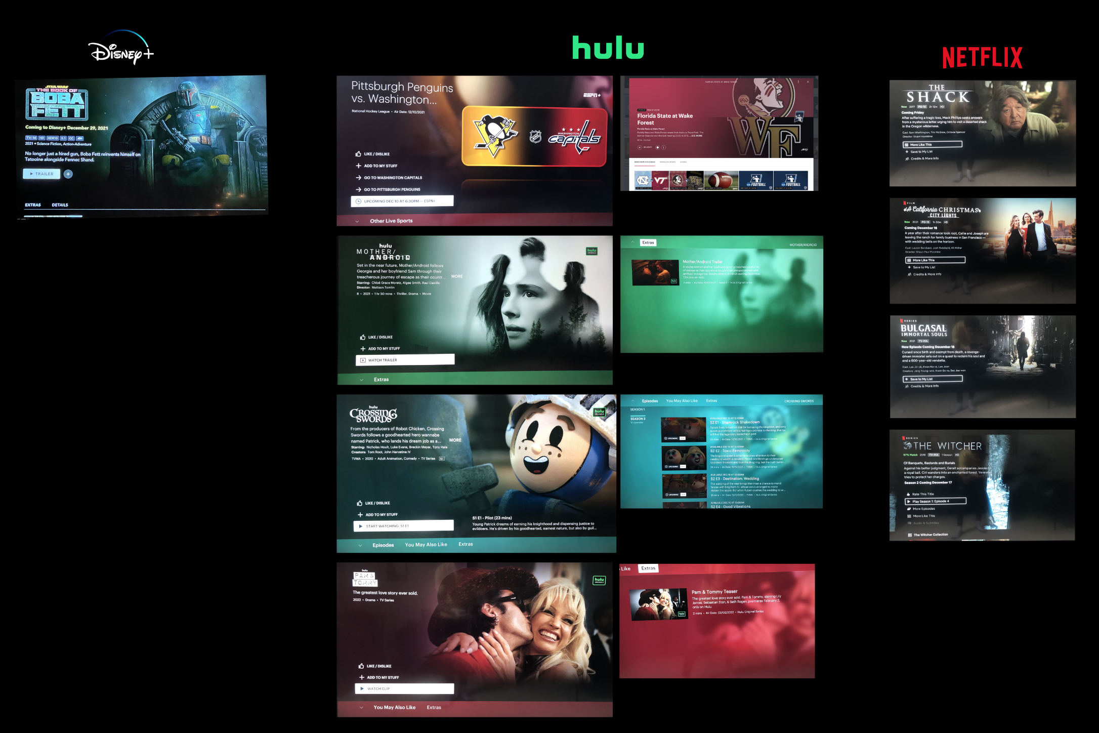
Even though the ask is for a PDP I still think it’s important to look at how others surface upcoming content outside of PDP and also do a TV run down of search for upcoming content. Fun fact: Hulu is the only one surfacing Upcoming content in their search results!

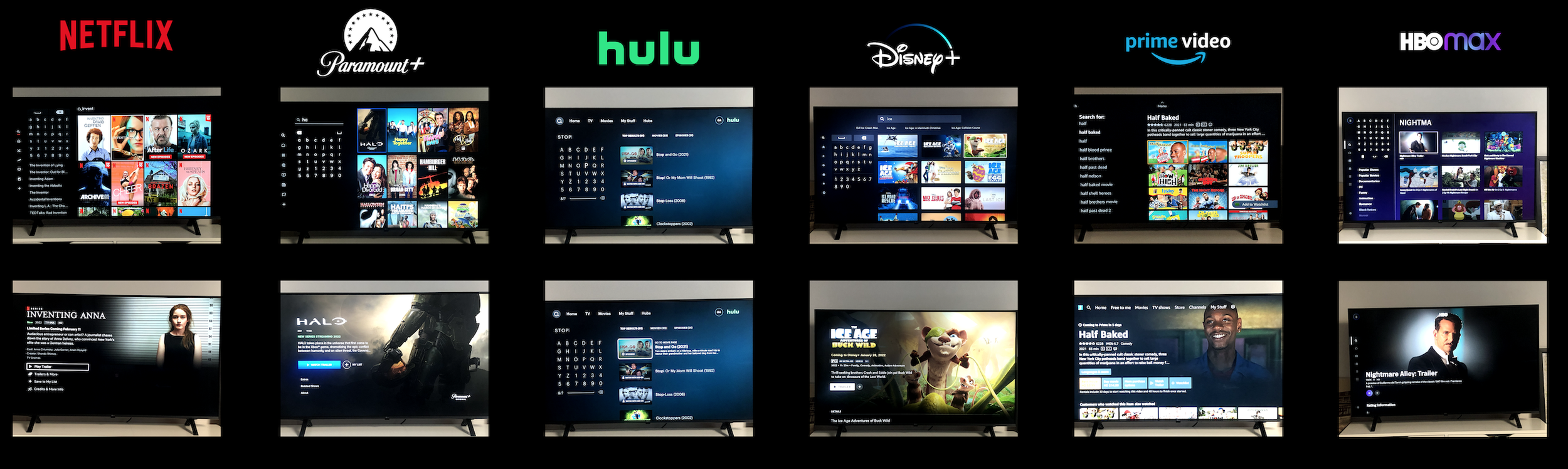
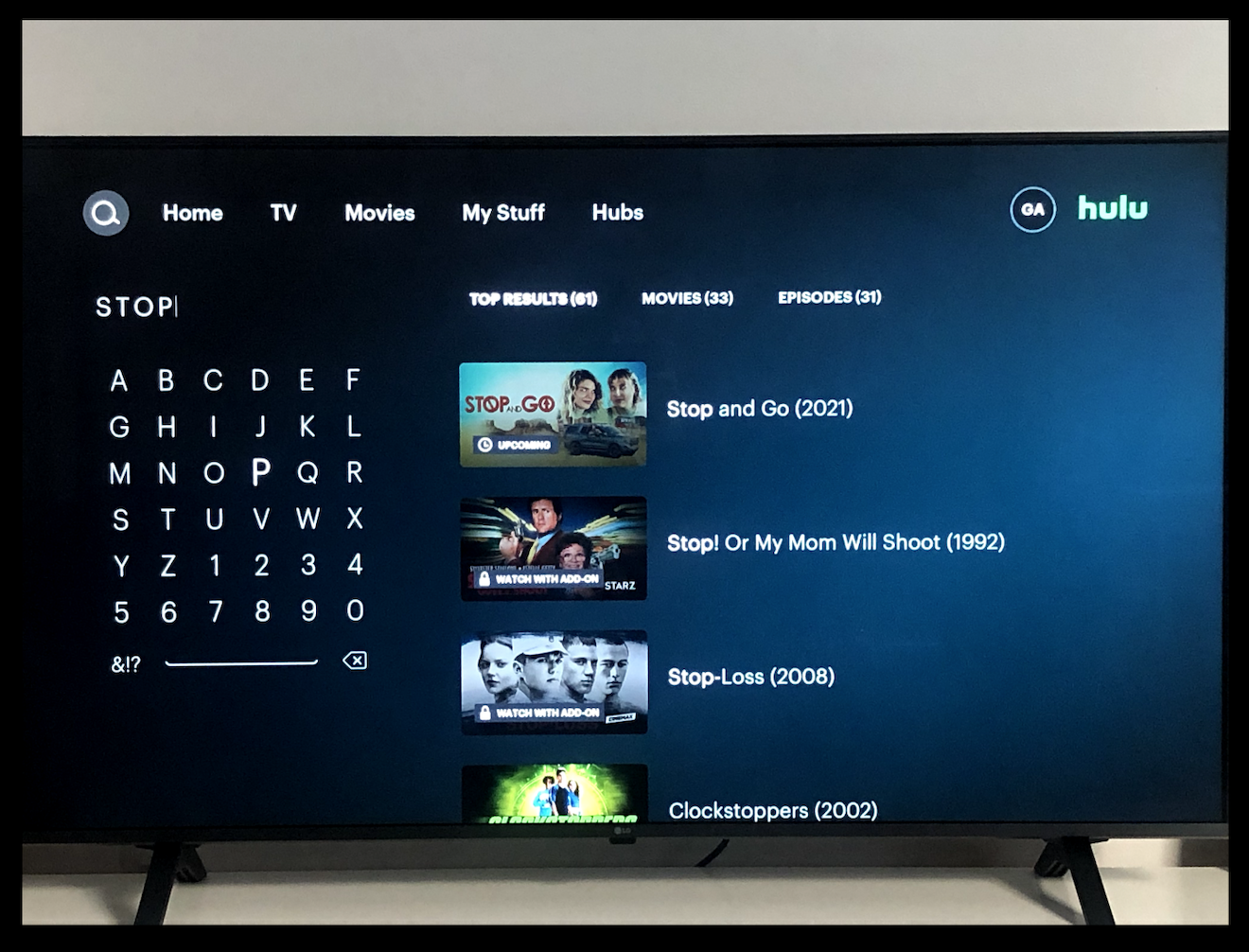
So as table stakes were concerned - we knew we needed some kind of availability tag.


Define & Ideate

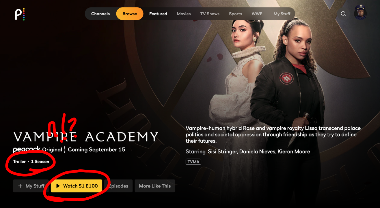
Right off the bat I knew that our sports section had Upcoming SLE PDP’s (say that three times fast) so we could leverage that design to keep tech lift low. These PDP’s were already using a clock icon and had unique navigation so it was a no brainer.

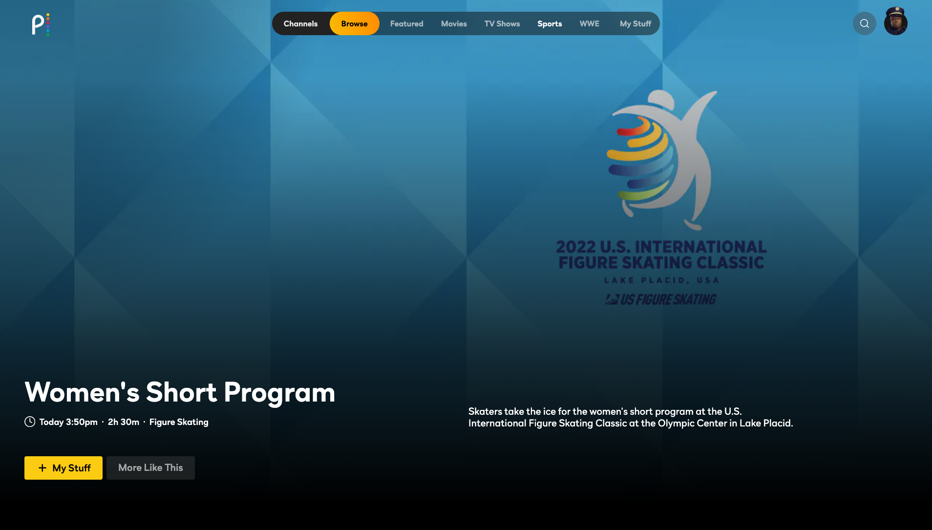
As it turned out, the metadata line used in SLE PDP was not the same on the backend as our VOD PDP which meant retrofitting was no longer an option. Though the position would remain the same, we needed to define a new field and icon specifically for VOD Upcoming PDP.

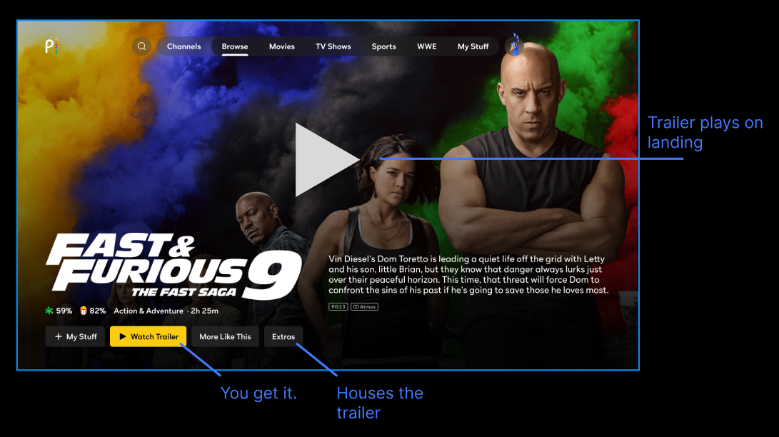
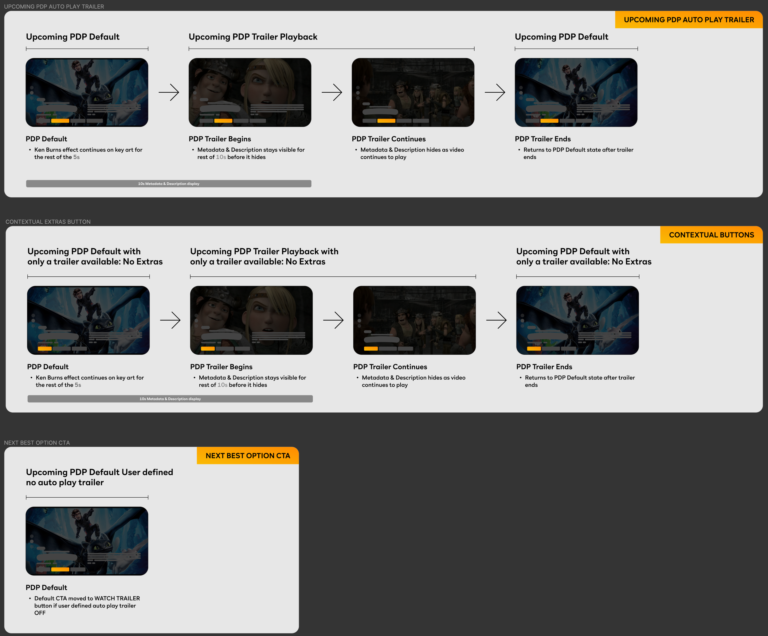
It was at this time that Peacock launched background autoplay and tech had assigned the trailer asset (which was the only asset for upcoming content) to play automatically at the upcoming PDP.

To me, this was an opportunity to enhance user experience. I’ll show you what I mean

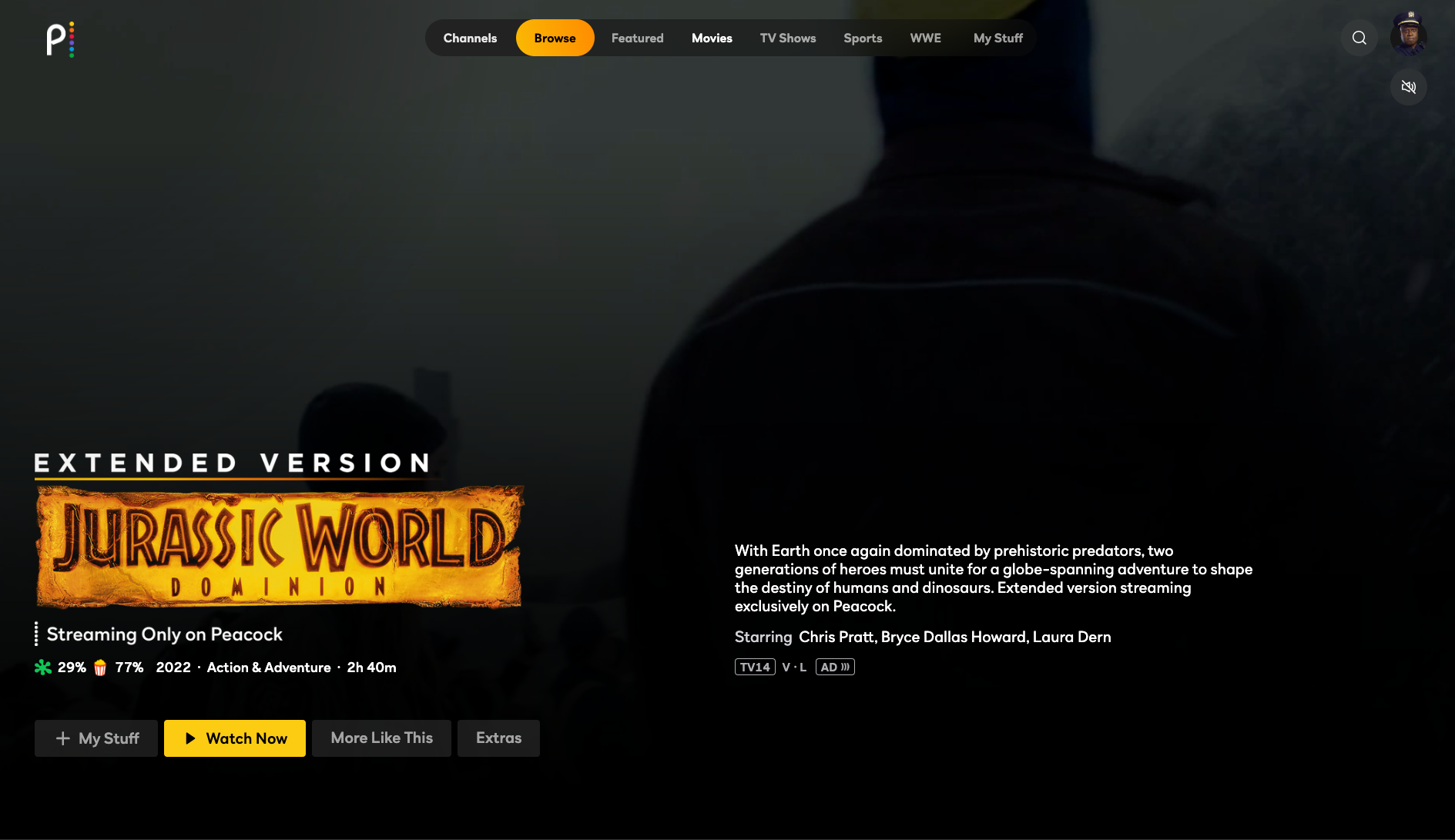
Having the trailer available in three different places was odd and frankly an “Extras” tab with no extras in it is misleading. My goal is to provide clear and enjoyable user experience while creating a unique PDP asset for the business, so we created the first rule for upcoming pdp.

• Don’t talk about Upcoming PDP… no wait..

• Upcoming PDP will not have an Extras tab if the only asset available to users is the trailer

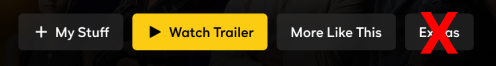
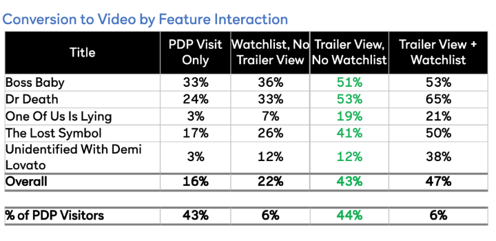
And hey, since we are already talking navigation let’s talk about that CTA. If the trailer is already playing we run the risk of users accidentally hitting the Watch Trailer CTA, certainly a frustrating experience. It also turns out that user who interact with a trailer and add to my stuff have the highest conversion rate.

So how about rule number two:

• The default CTA for Upcoming PDP will be + My Stuff

With these rules, the flow began to take shape.

I presented our first iteration to leadership who expressed concern about the new icon. Does it signal “upcoming"?

Not really.

So I put together a whole slew of icons that I thought could be representative of upcoming content and asked my team to vote!

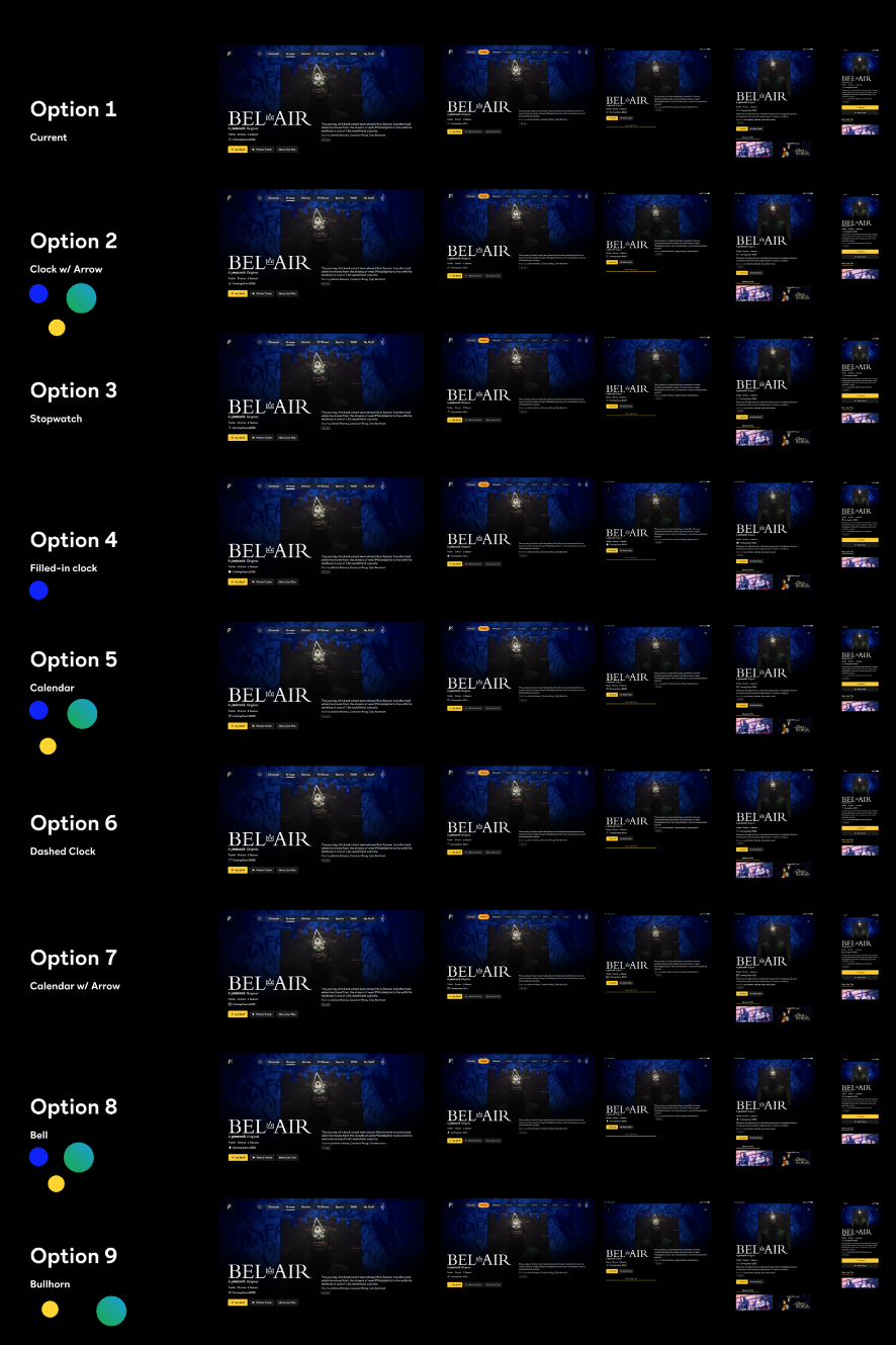
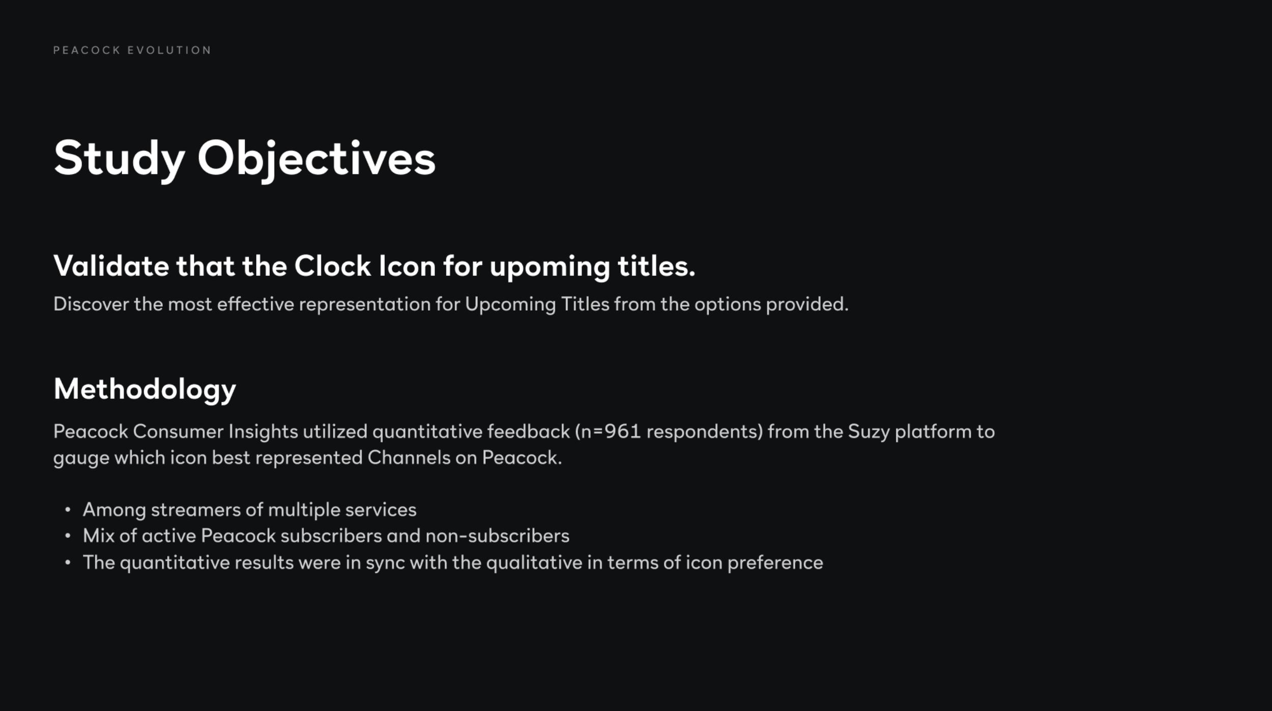
After the vote was over, we were left with our top five. I then worked with our research team to put together a quick study to get a bead on things

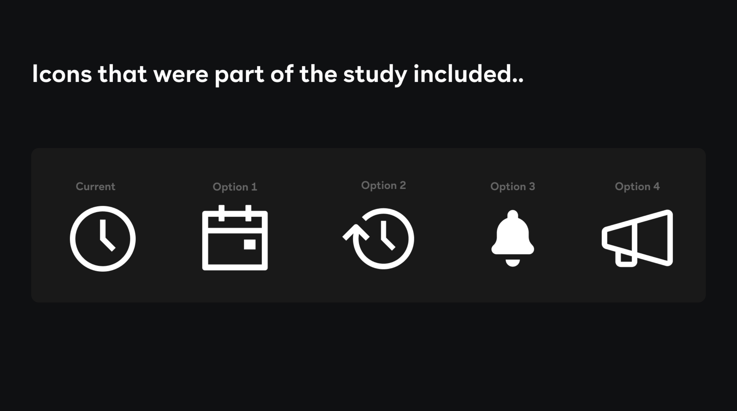
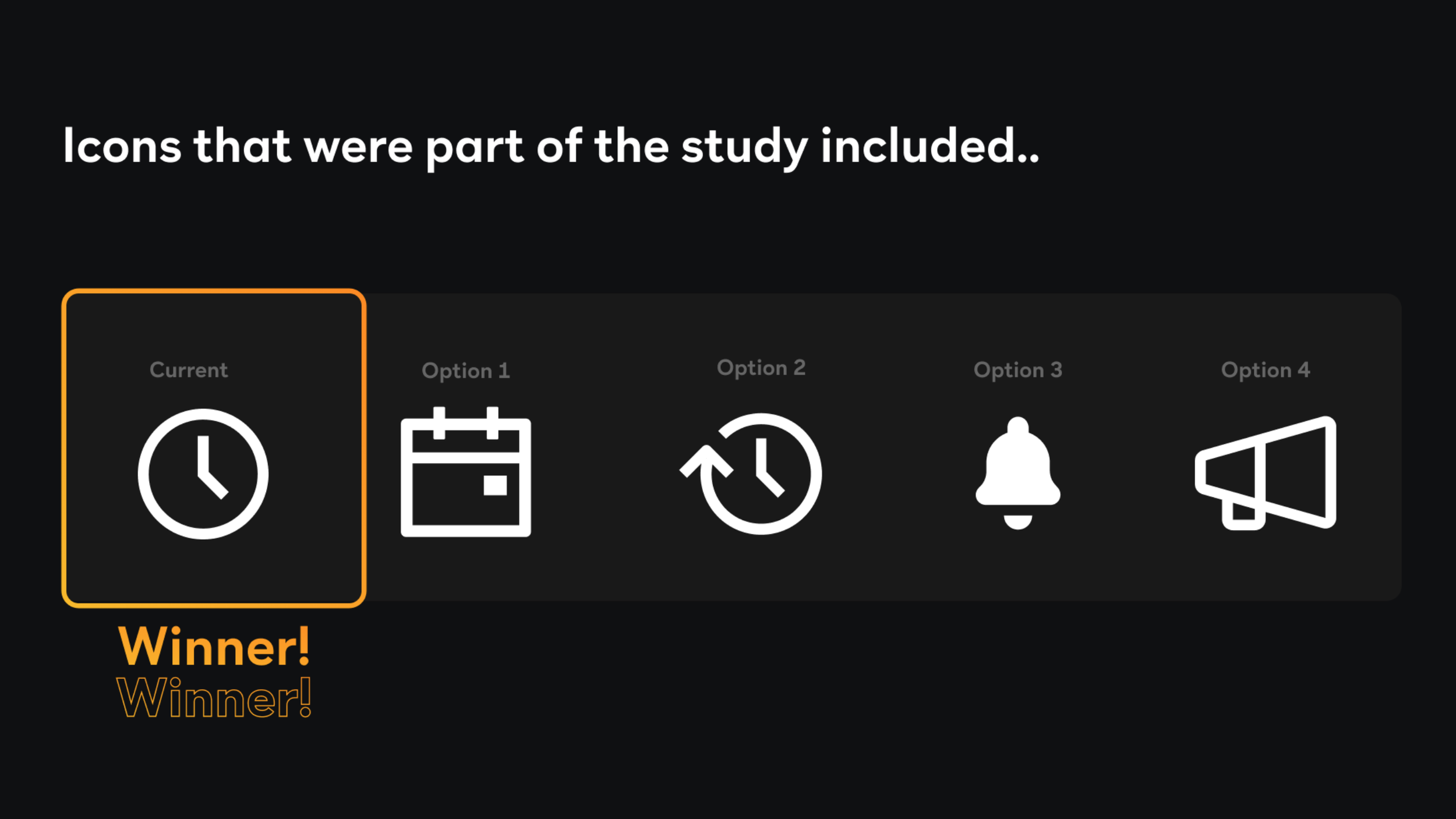
It was a blowout. Not even close.

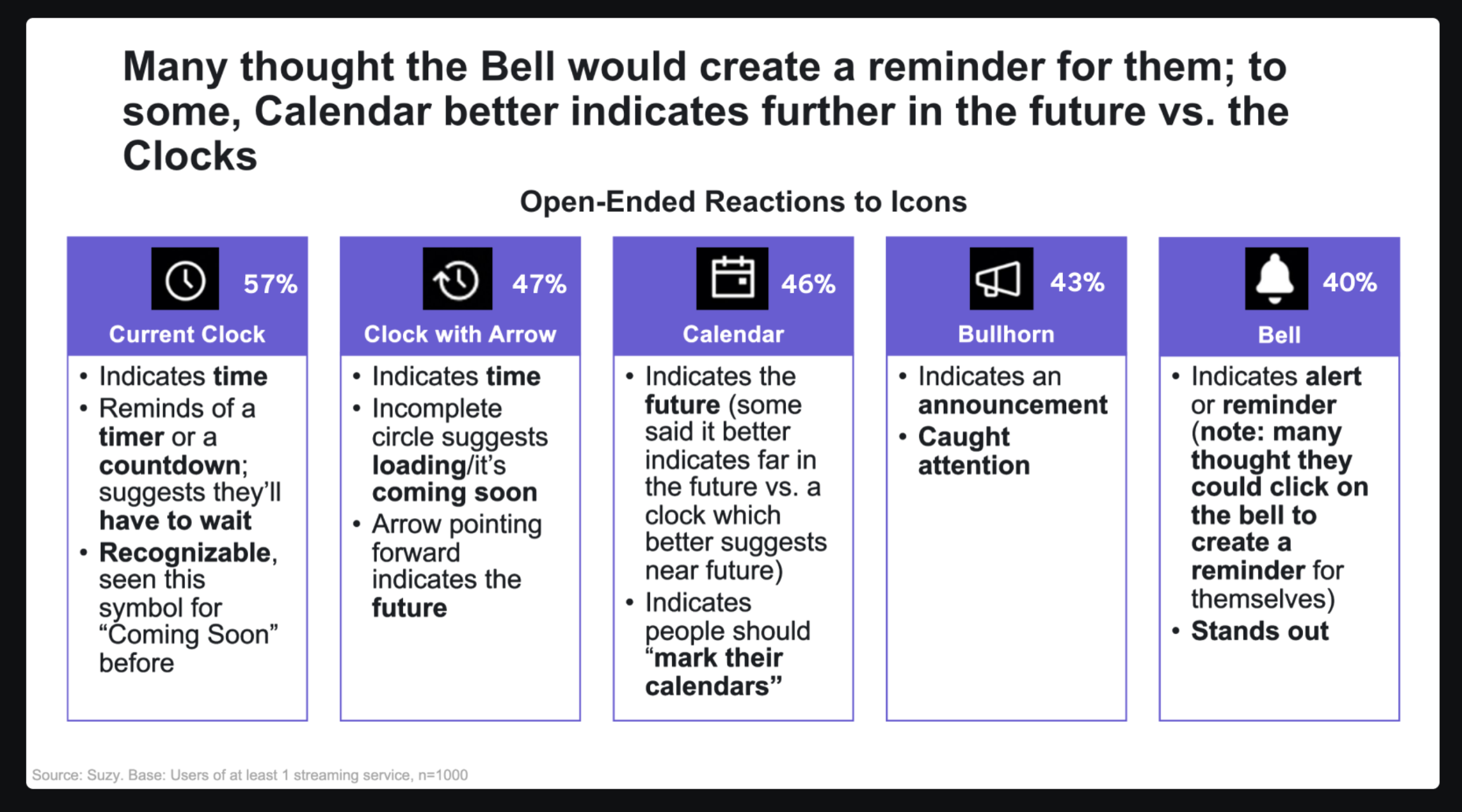
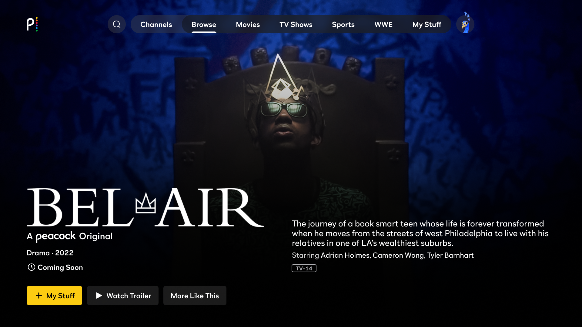
With data in hand we drafted up the final iteration. An Upcoming PDP with its own availability tag metadata field, an extras tab that only exists if there are extras and a CTA that help the user choose to add to watch list while they automatically interact with the trailer!

Something I loved about Netflix is there specificity of their availability language so I set up a meeting to discuss what was feasible in regards to our availability tags.

What can we say and when can we say it?

After numerous meetings and back and fourths we were finally able to make a final recommendation.

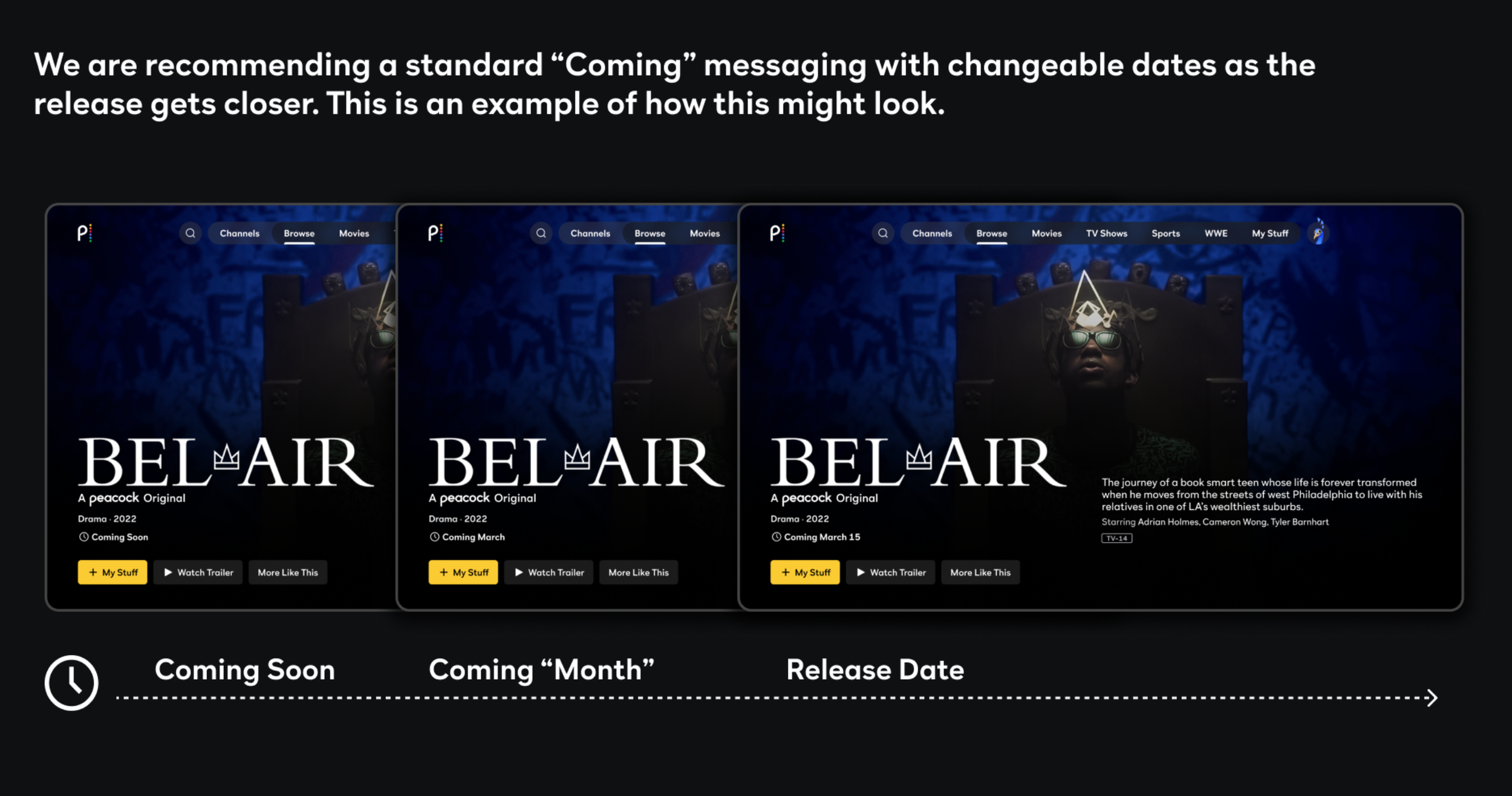
Leadership loved it.

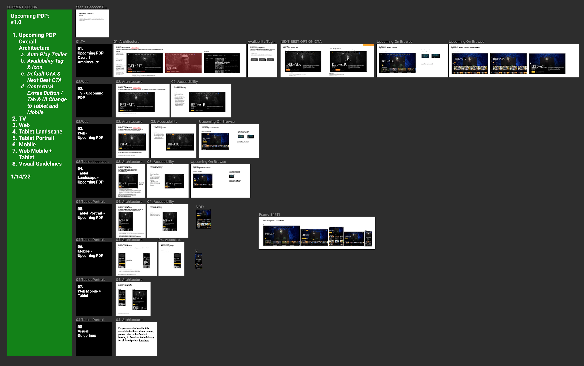
Green light ahoy! Let’s make sure to apply these design principals to all devices!

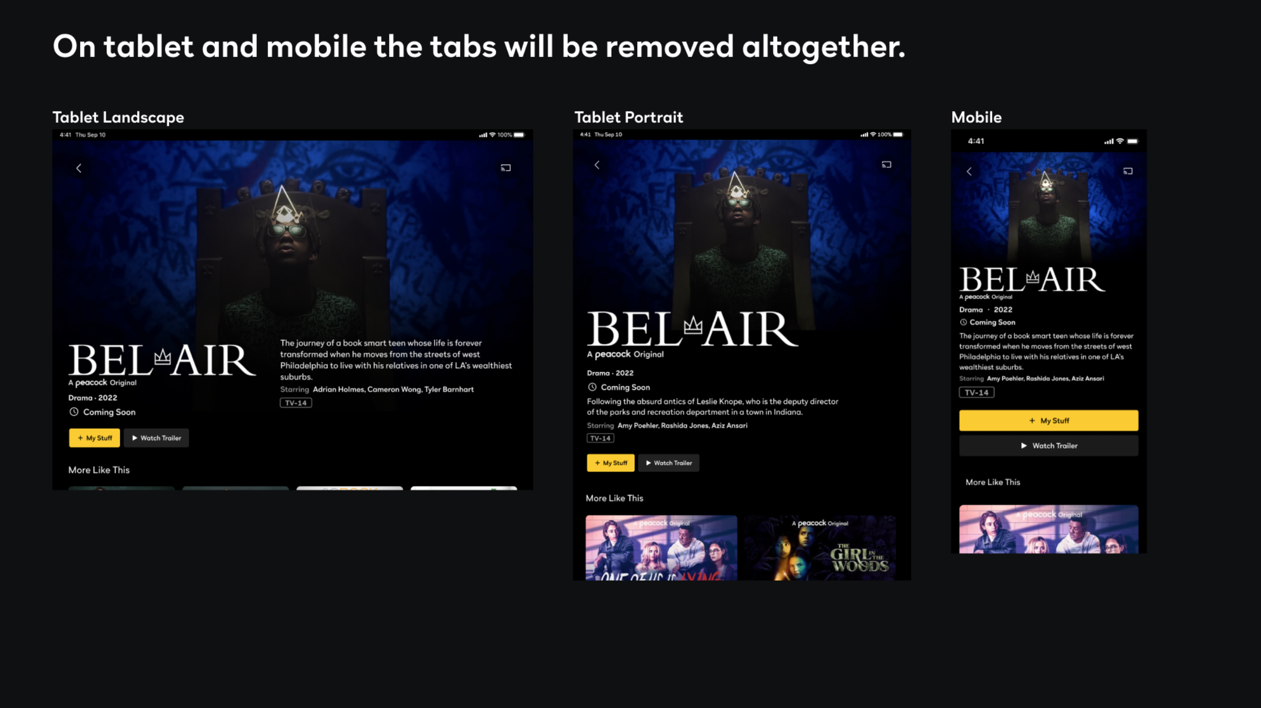
And finally, delivery to tech, providing exact overall architecture, use cases and functionality over all devices with links to previous guidelines where needed.

This project was a doozy and took two designers about two months to complete.


Unfortunately I don’t have the time to go through anything else, but here are some other deliveries I could be talking about :P