
“One Take Only” or OTO is an app that connects fans to musicians for a personalized video performance. The clients, Olivia and her brother Nick were beginning to reach out to investors and needed a high fidelity prototype that could wow them ASAP. They had a strong concept and high ambitions so the first step was getting alignment.
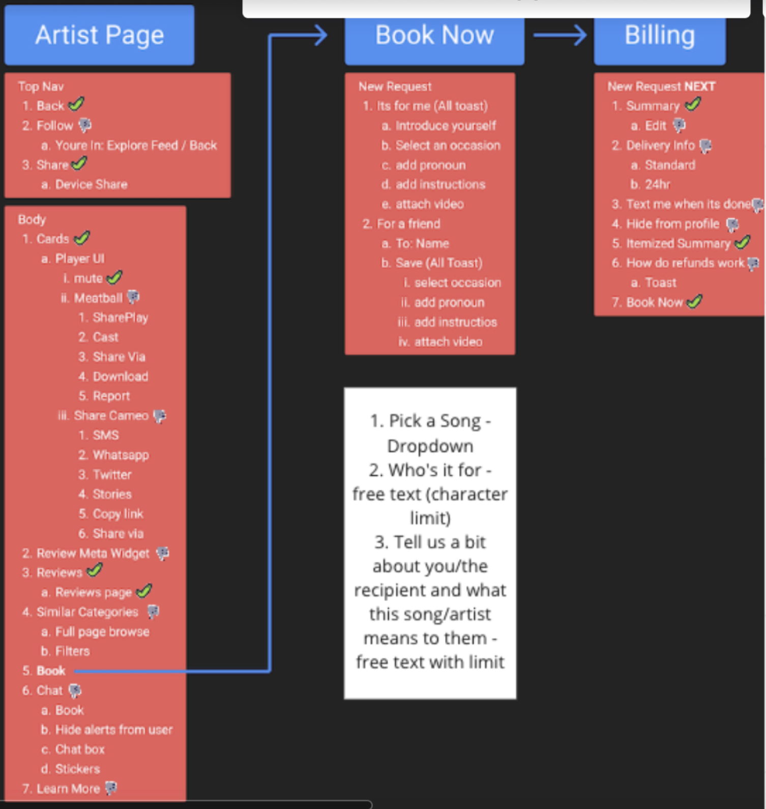
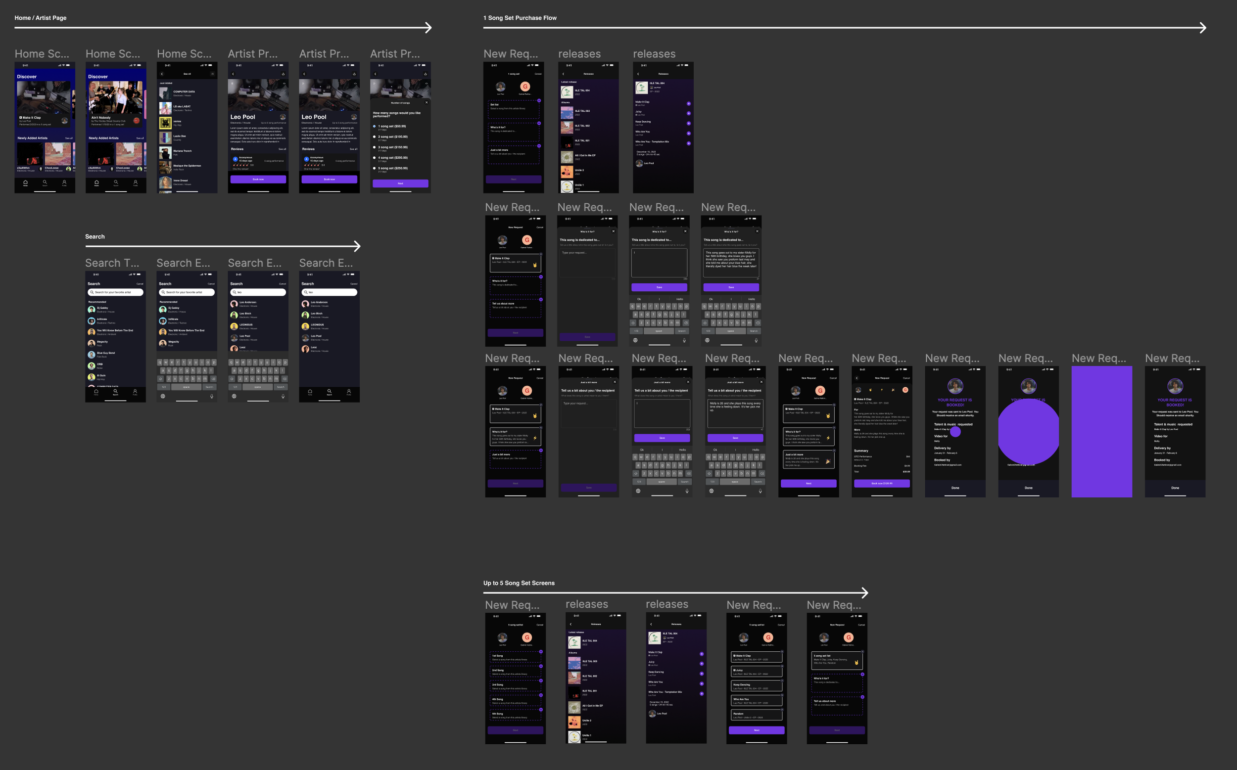
In an email they had requested “A home, artist page, booking and billing screen” that would be based on the Cameo and Hinge apps, however it quickly became evident they were going to need more than just a few screens. To clarify the scope, I made an app map of functionality for all the requested screens.
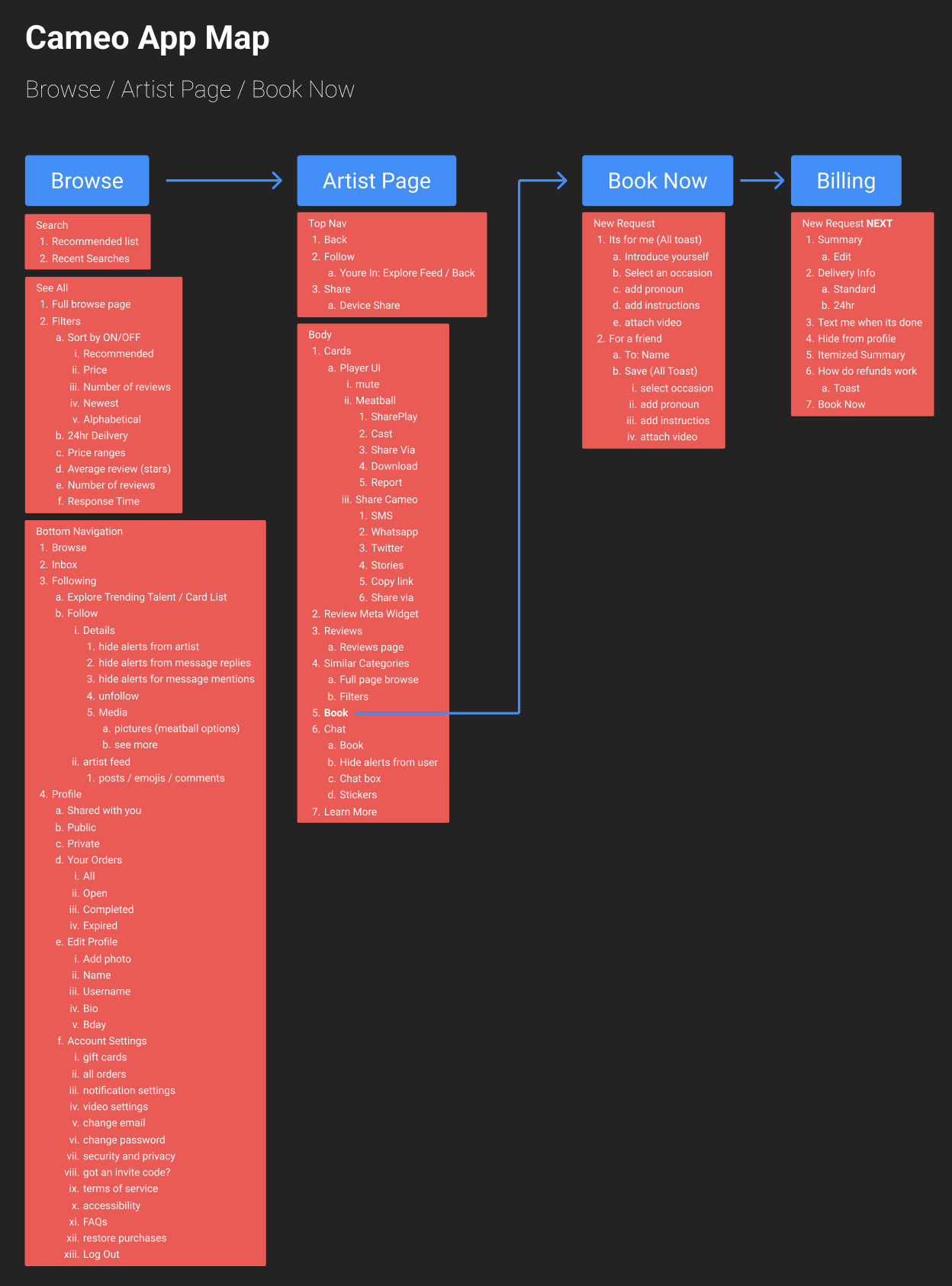
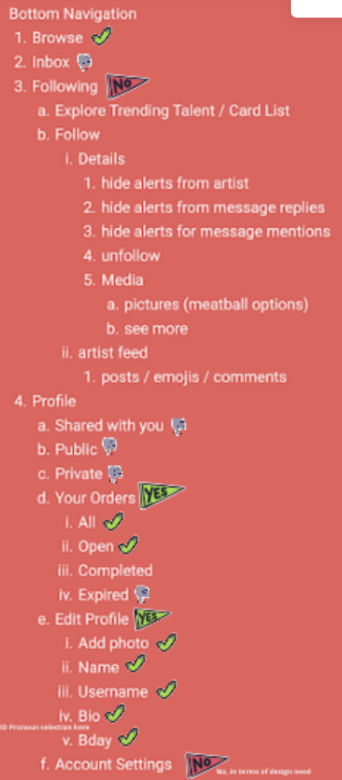
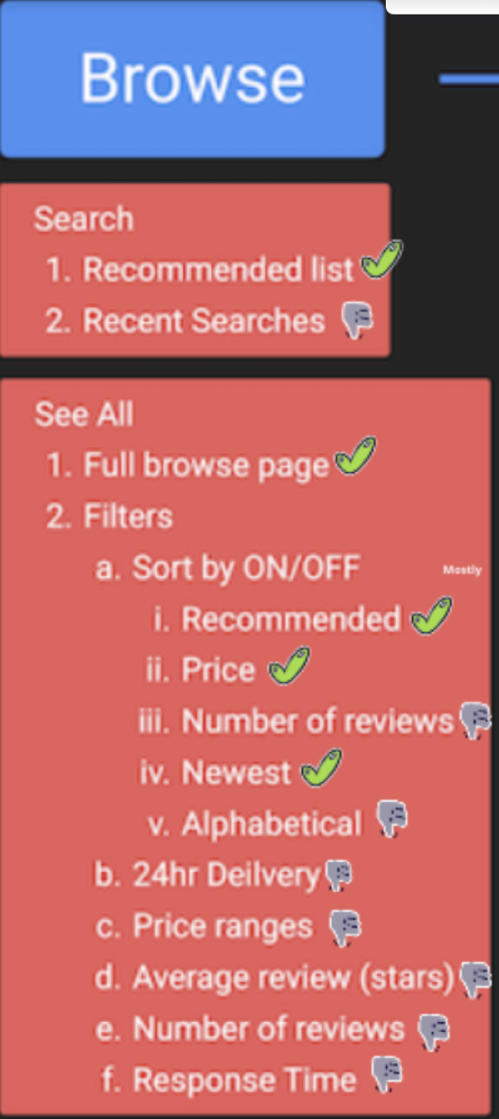
On a call together, we went through each page and marked what they needed along with what they could do without. The resulting list became essentially my backlog.
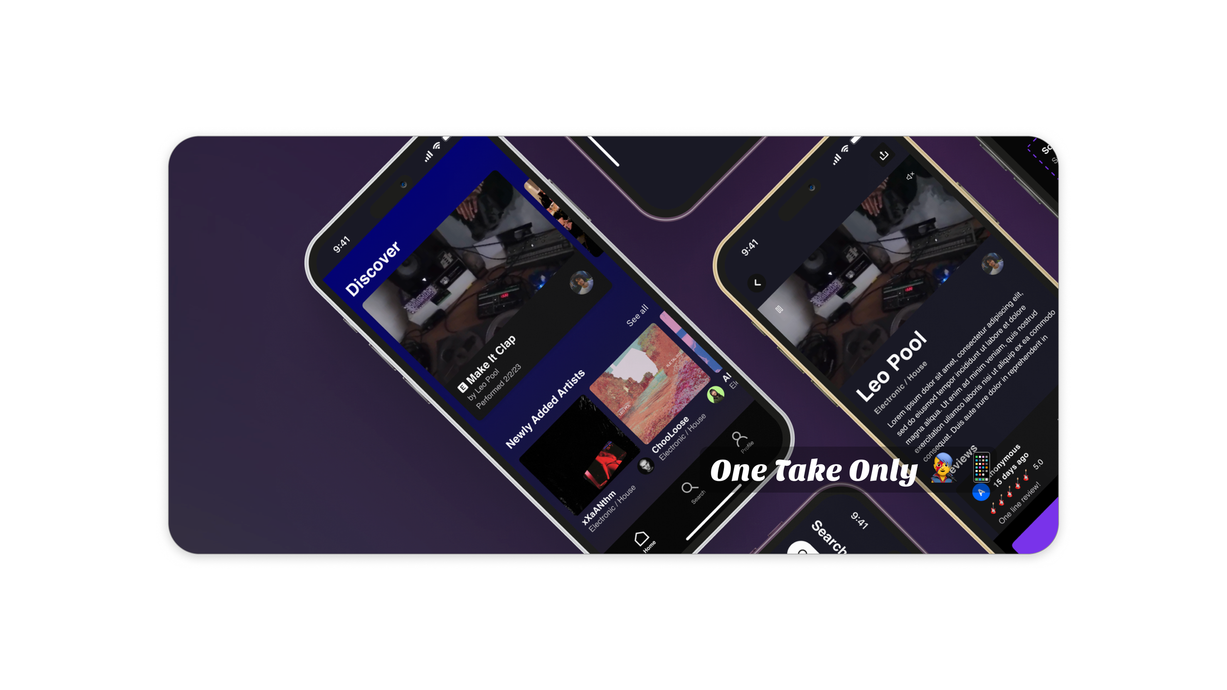
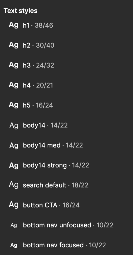
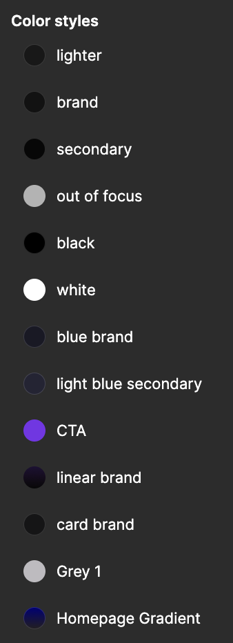
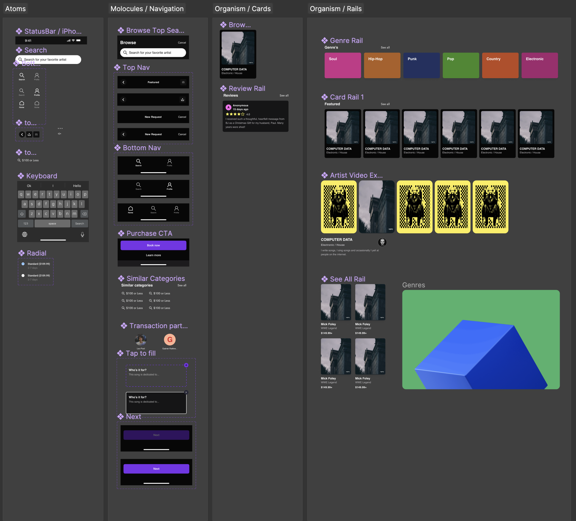
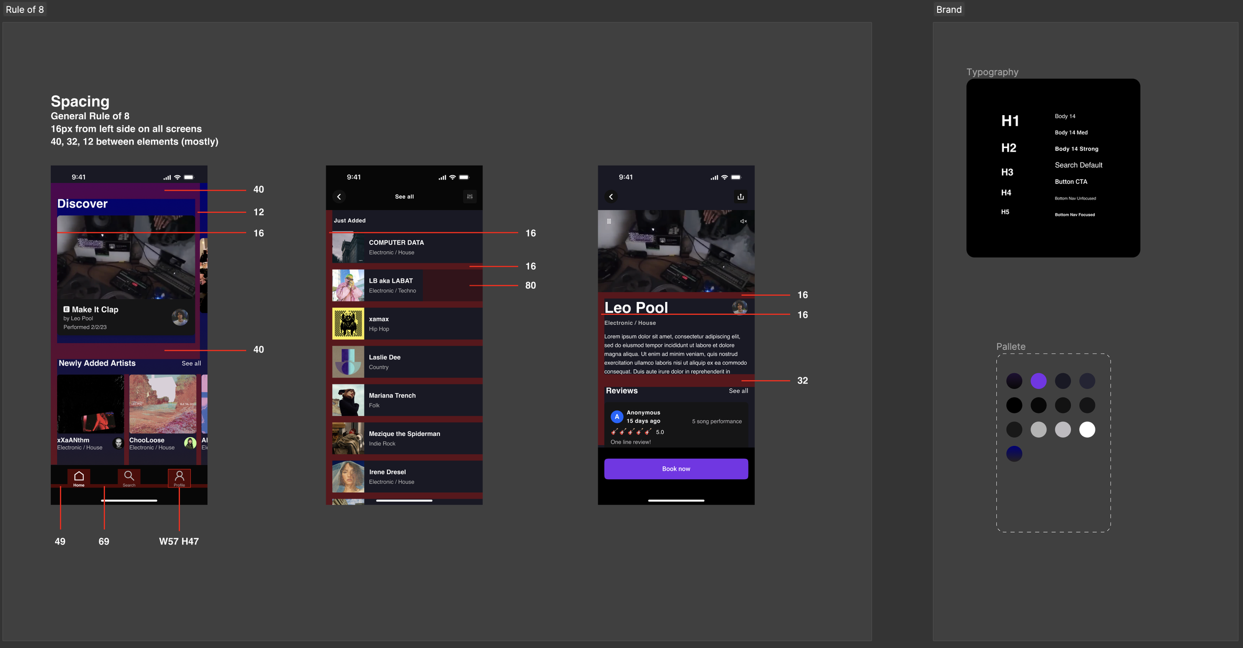
Olivia and Nick were in a hurry and didn’t need a fleshed out brand, just something that looked good for an introduction. Spotify was my preferred typography influence so I paired Helvetica with Roboto. For the palette, I went with a dark blue/purple and funky purple to highlight the fun musical quality of the idea. From there, I audited Spotify, Cameo and Hinge on iOS and started making components I knew I would need (avatars, buttons, toasts, etc).
My first iteration included the entire purchase flow but skimped on many of the details that make an app shine. This first round was great to get a read of the room and a gut check from the clients on my decisions some of which were:
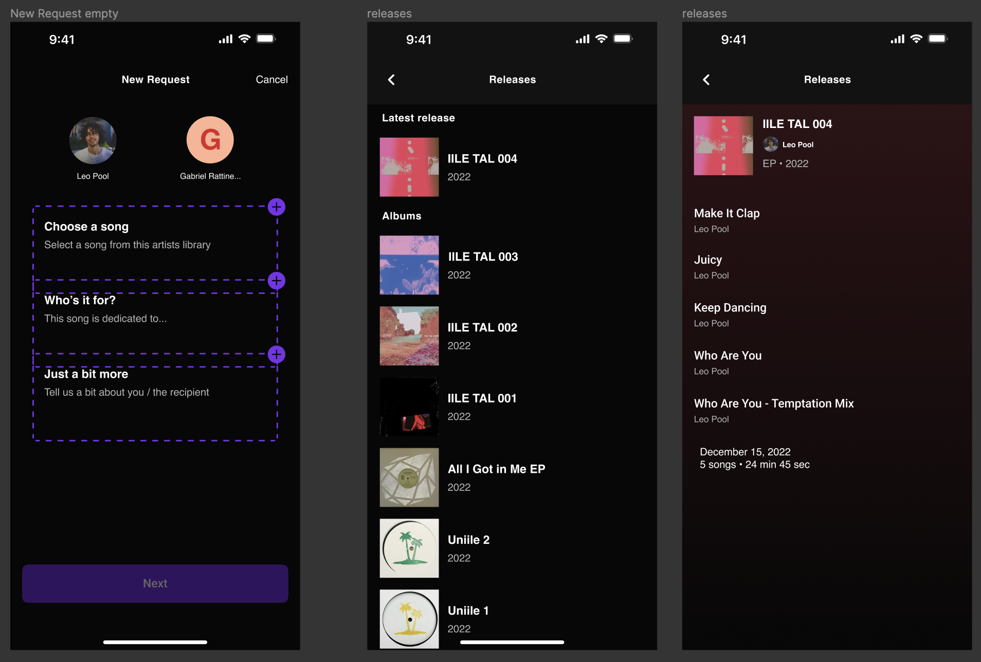
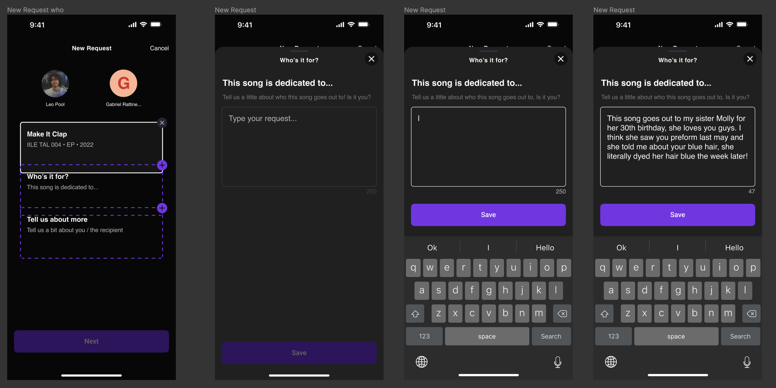
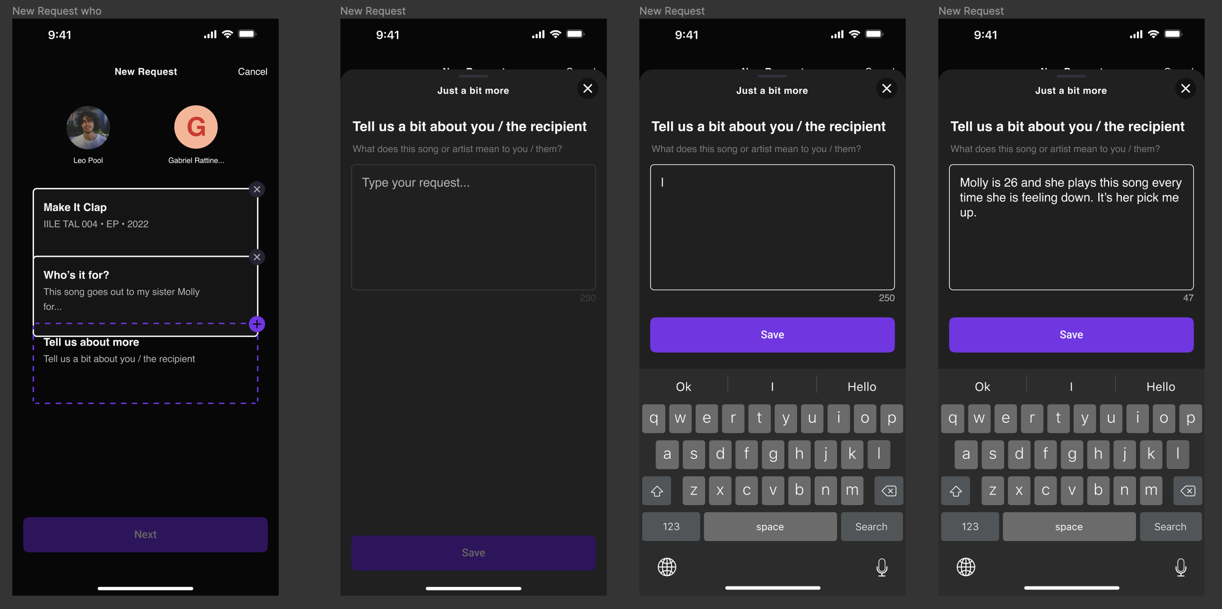
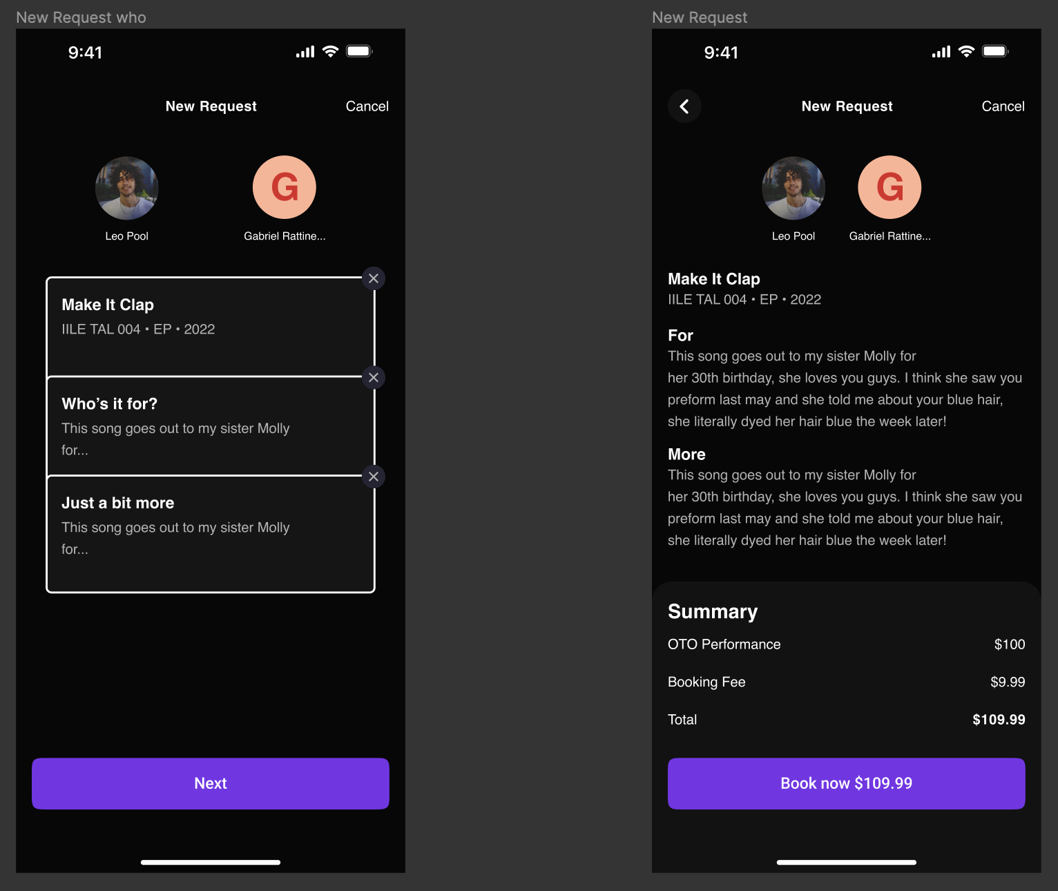
• A book now screen that mimics Cameo but with prompts similar to hinge
• A single song selection so the artist can always expect to record only a single song
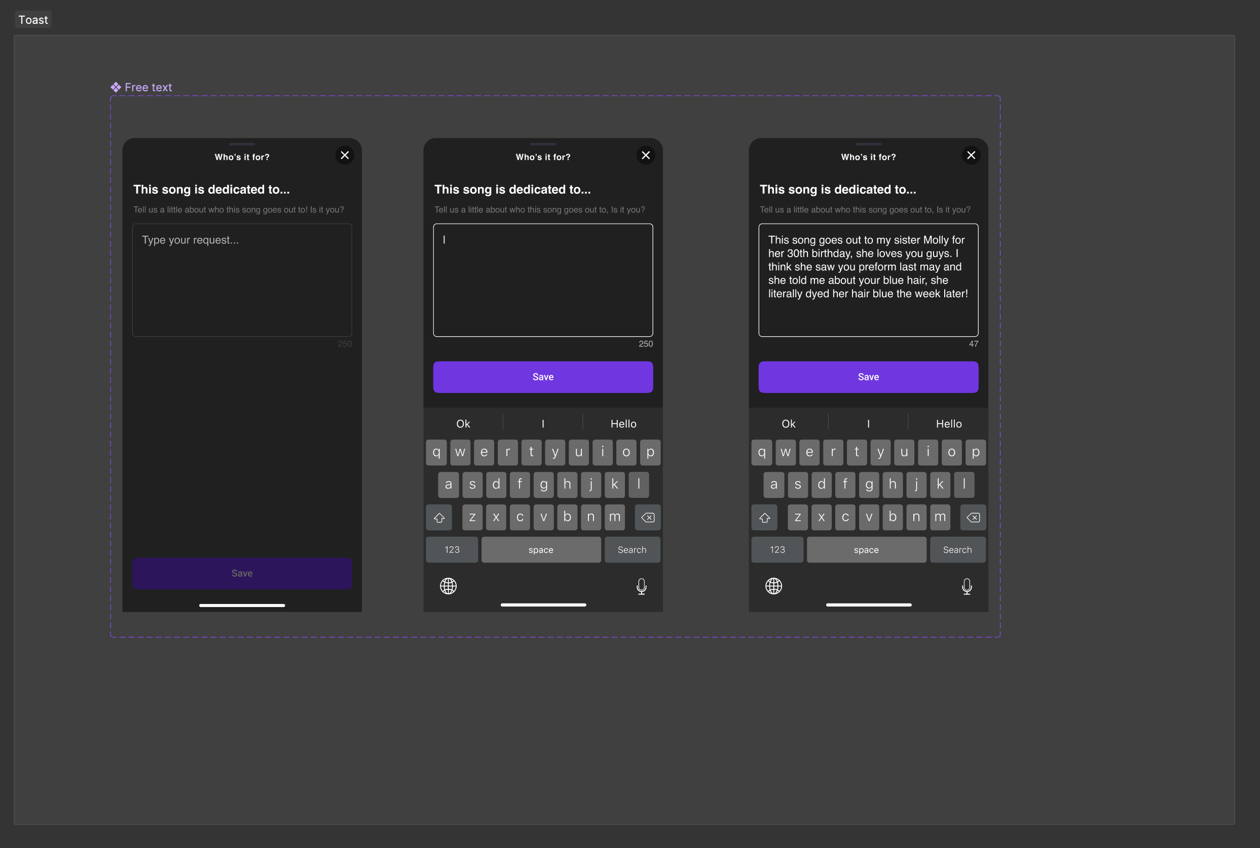
• A dedication field to let the artist know who the song was for
• A “Just a bit more” field to help the artist personalize the performance by getting an understanding of the recipient
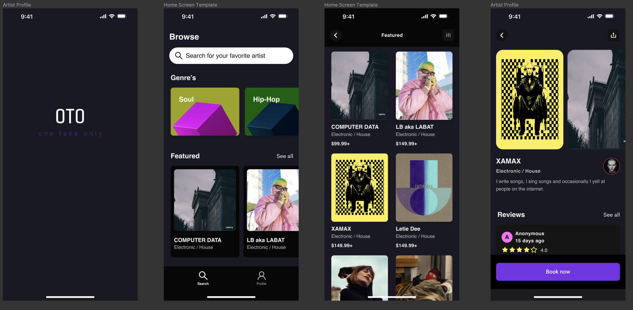
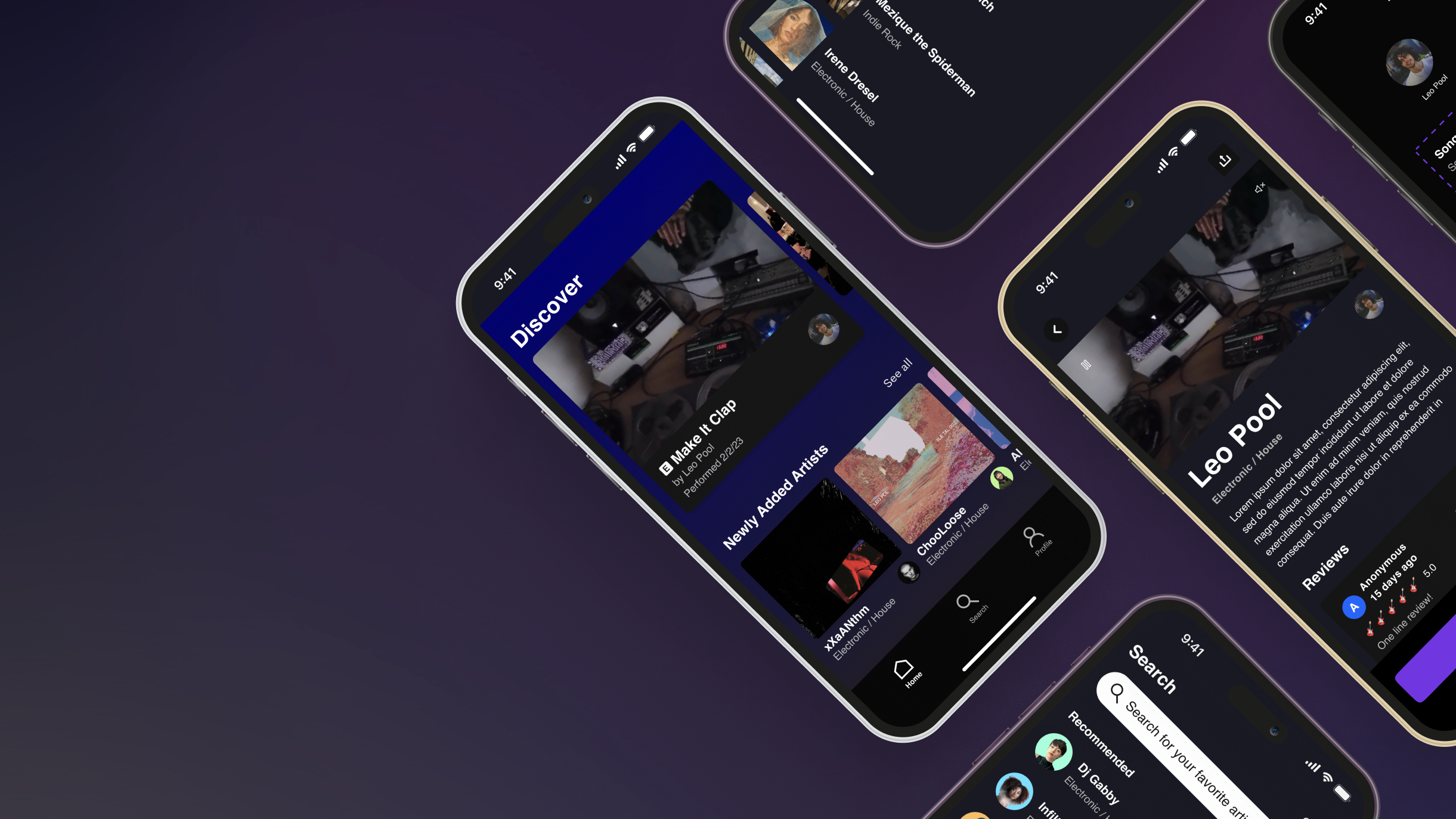
The clients loved the initial idea but together we discussed the value of the home screen. Initially they wanted a search bar and genre rail however the app is targeting smaller musicians not the big artists and while the target user is meant to purchase a performance, the musicians are just as important. For this reason, I recommended we facilitate discovery over search and incentivize users to explore artists they may have never heard of. In the next iteration, I replaced the search bar with a “Discover” rail, put search in the main navigation and added audio preview along with video in the artist page.
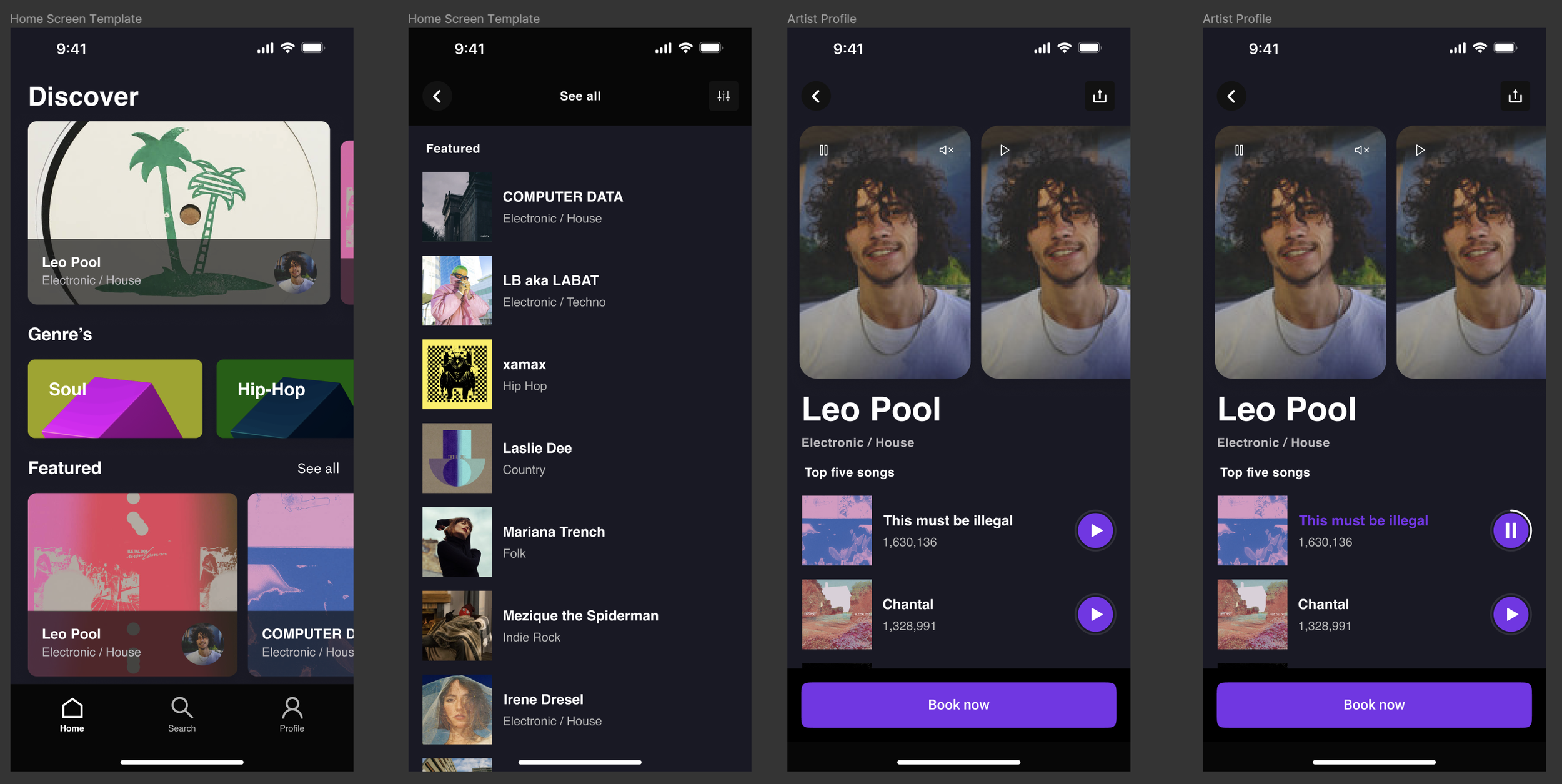
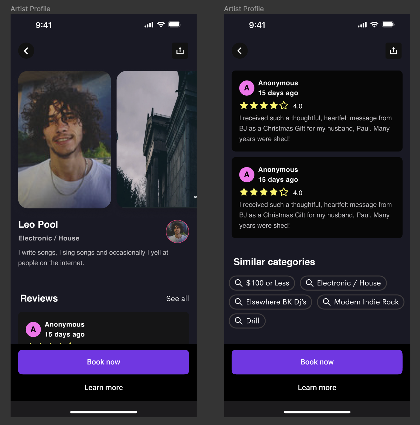
The clients loved the new home screen but were missing the artist bio and while we all loved the audio preview, we felt it may be in the wrong place as these previews would be better during the song selection itself. It also occurred to me that the artists would likely film themselves correctly (unlike cameo) and so I opted for full width 16:9 video in the artist page.
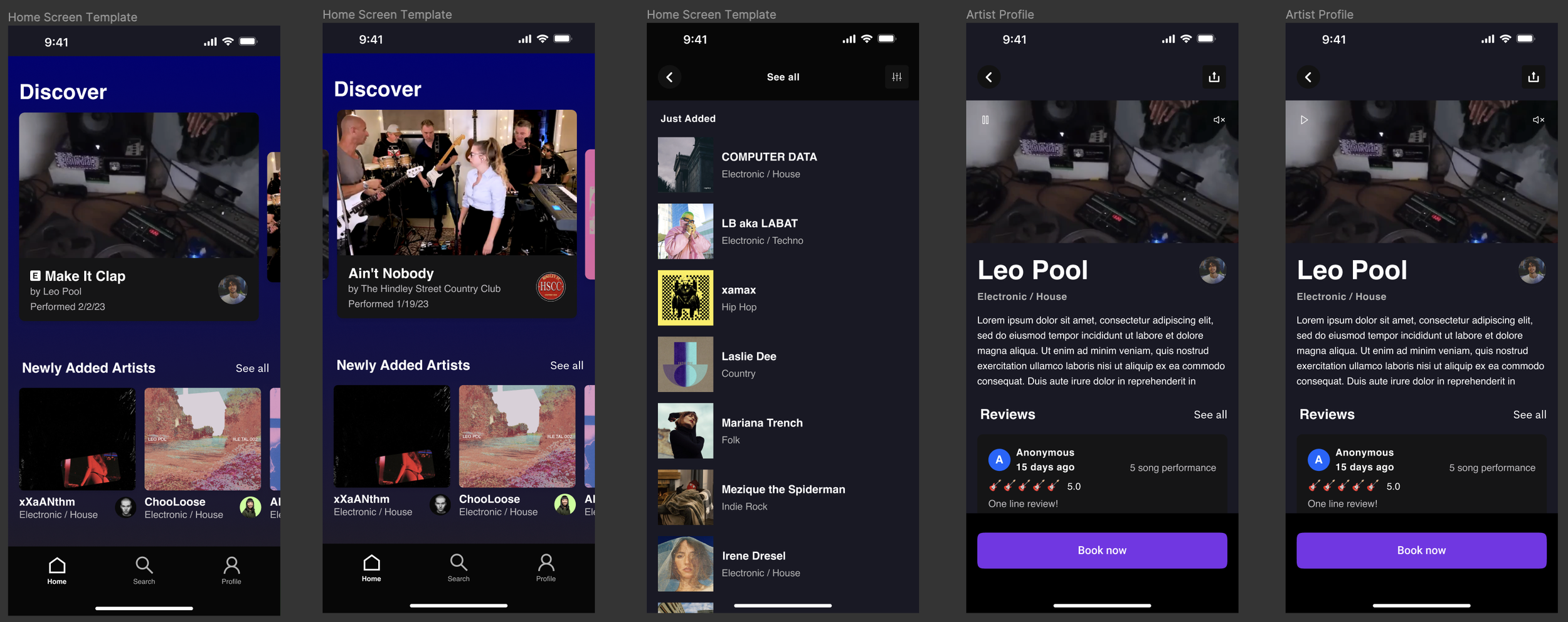
I went ahead and added some fun prompts for users during their booking to help solidify the bond between user and artist and included an option for speedy delivery which artists could disable on their end in the future. The clients were thrilled and after only a few weeks I was able to deliver them a snazzy Prototype.
Finally, I prepped a very fast tech delivery with all screens pixel perfect along with some marketing material with room for titles for their pitch decks. The overall product isn’t perfect but for such a fast turn around (about a three weeks) I feel confident I got Olivia and Nick what they needed to take their next steps.
<3