
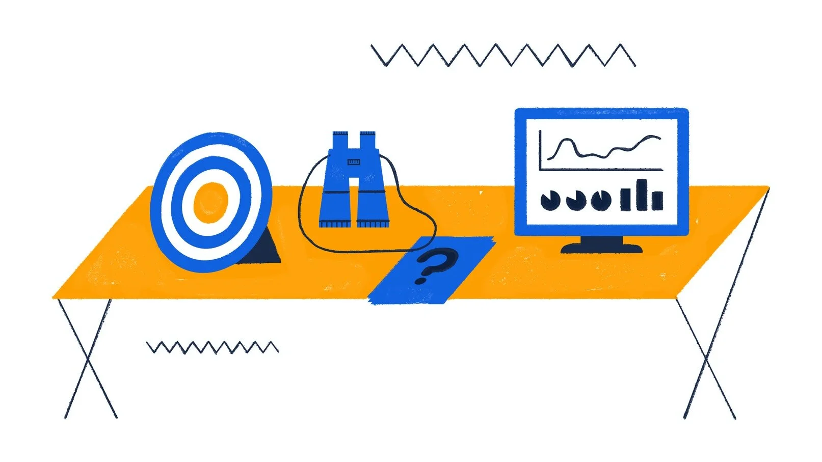
CTcue USA: Kick Off & Redesign
Role: Lead UX Designer at CTcue (Parent company IQVIA)
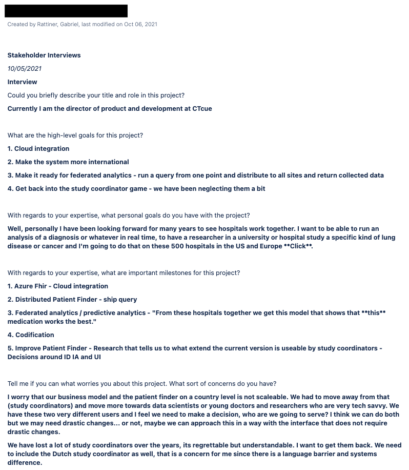
CTcue is planning the next phase of it’s lifecycle and has acquired seven new stakeholders! It is important to help align the team and myself since there are many new faces with different perspectives of the project goals, business goals, milestones, constraints and questions around scope. To get on the same page, I start with stakeholder interviews.
Oh, hello team
CTcue is already established in the Netherlands however the new team is flush with assumptions. We need to get on the same page.
To whom it may concern,
What is your role in this project? What are the high-level goals? What are your personal goals? What important milestones are there? What concerns do you have? How will this project impact the business?
Thanks!
Gabe
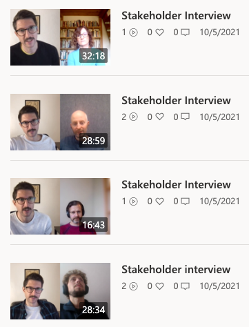
Oh the pretty faces
The new stakeholders have incredibly different perspectives and have already revealed many assumptions
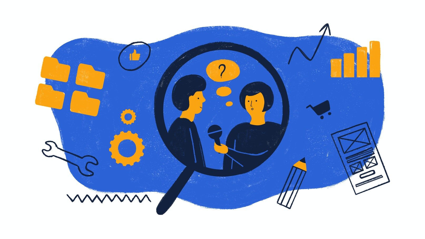
Transcribe it all
A focused transcription distills responses down to their essence leaving out the ahh’s and umm’s and getting to the heart of their answers
This takes some time but it’s worth it. Not only does this allow the team to review the transcripts, it also allows me to fully internalize the interview, take better notes and tactfully leave out any sensitive information that may have been said.
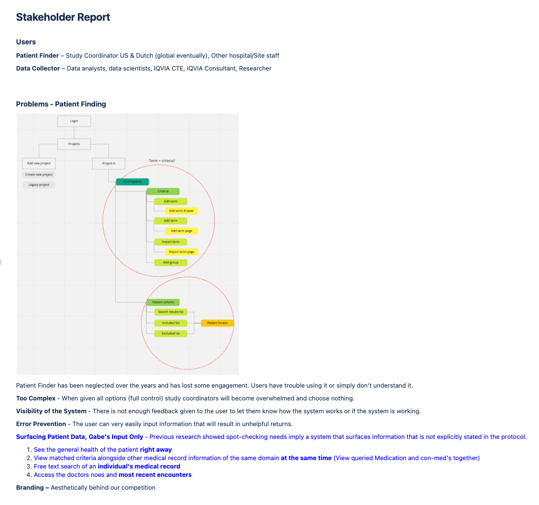
Stakeholder report
The team waits with baited breath
When ready, I present my summarized report and point out patterns. Sometimes a stakeholder report is a great way to bond the team and hone intention. A moment like this will do wonders for the teams morale:
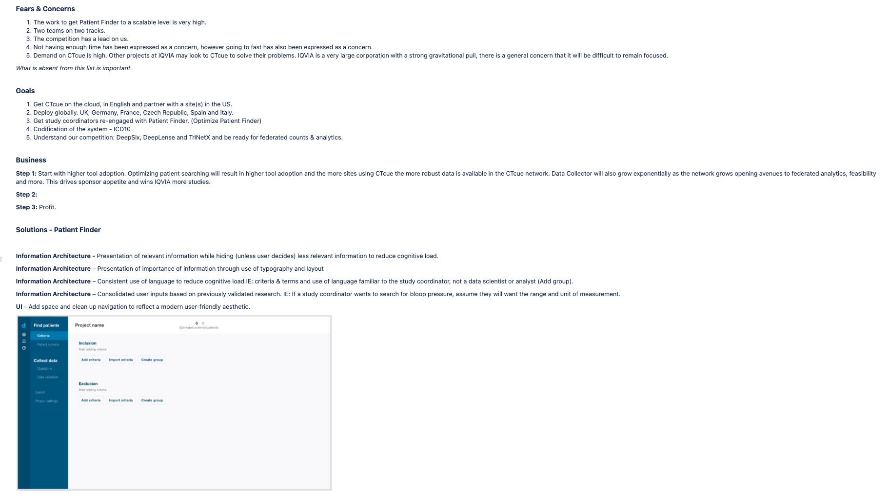
“Some of us have concerns the work ahead is vast and time consuming, however some have also expressed concern that we are going to go too fast and not take our time as needed. This shows that all of us, including our leadership, want to get this right. We all want to stick the landing, have confidence knowing we have the support to do so.”
Everyone liked that :p
Together, as a team, we have identified the users, project goals, business goals, fears & concerns, problems, solutions, unique value propositions and our competitive advantages.
How this will effect design
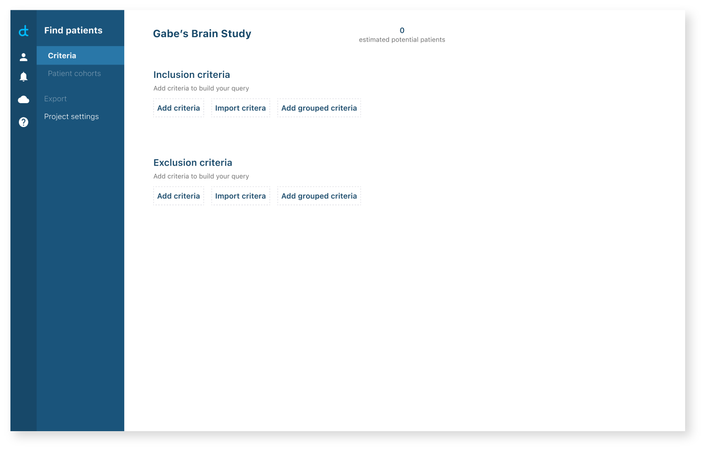
Problem - Patient Finder
“Patient Finder” a feature, was the most obvious problem to come out of stakeholder interviews. It has been neglected for years and becuase of that has lost some user engagement. Users report having trouble with, not getting use out of it or simply misunderstanding it altogether. So why is that?
Too Complex - When given all options (full control) study coordinators will become overwhelmed and choose nothing.
Visibility of the System - There is not enough feedback given to the user to let them know how the system works or if the system is working.
Error Prevention - The user can very easily input information that will result in unhelpful returns.
Branding & UI – Aesthetically behind our competition
Surfacing Patient Data - Previous research showed spot-checking needs imply a system that surfaces information that is not explicitly stated in the protocol.
See the general health of the patient right away
View matched criteria alongside other medical record information of the same domain at the same time (View queried Medication and con-med's together)
Free text search of an individual's medical record
Access the doctors notes - most recent encounters
Reduce complexity
The strategy is to focus on information architecture first, then user flow & slight changes to the UI. Start small but make a big impact.
Solutions
Information Architecture - Presentation of relevant information while hiding (unless user decides) less relevant information to reduce cognitive load.
Information Architecture – Convey importance of information through strategic typography and layout
Information Architecture – Consistent use of language to reduce cognitive load IE: criteria & terms and use of language familiar to the study coordinator, not a data scientist or analyst (Add group).
Information Architecture – Consolidate user inputs based on previously validated research. IE: If a study coordinator wants to search for bloop pressure, assume they will want the range and unit of measurement.
UI - Add space, color and clean up navigation giving us a modern user-friendly aesthetic.
Getting buy in
Show, don’t tell
Having a meeting and agreeing as team is one thing, but showing the team how this complexity is affecting our users is another. Buy-in is super important at this early stage, especially for UX which can run into design hurdles from stakeholders who need further evidence.
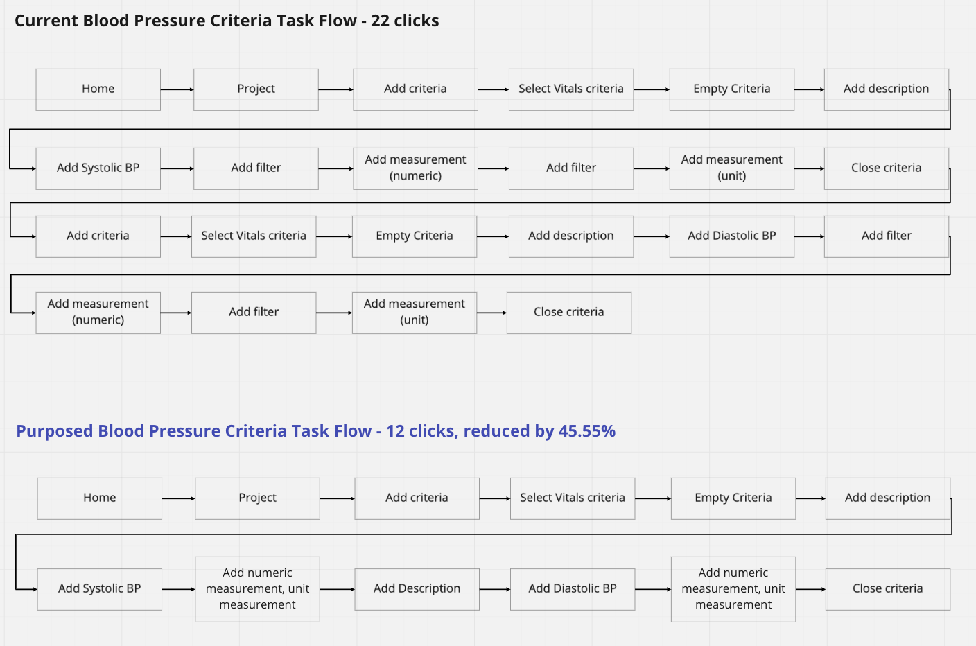
Task flow is one way to illustrate user complexity, with this task flow I am able to recommend a change that will reduce user input by 45.55%!
I dig into the teams Figma file and start pushing pixels making slight changes to Information architecture as previously discussed.
Consistent navigation with hierarchy of importance, a grid layout, consistent typography that conveys meaning and structure, use of disabled status to guide the user, error prevention tooltips and finally limiting screen items; if it’s not needed on the screen, hide it.
Results
Before recommended changes
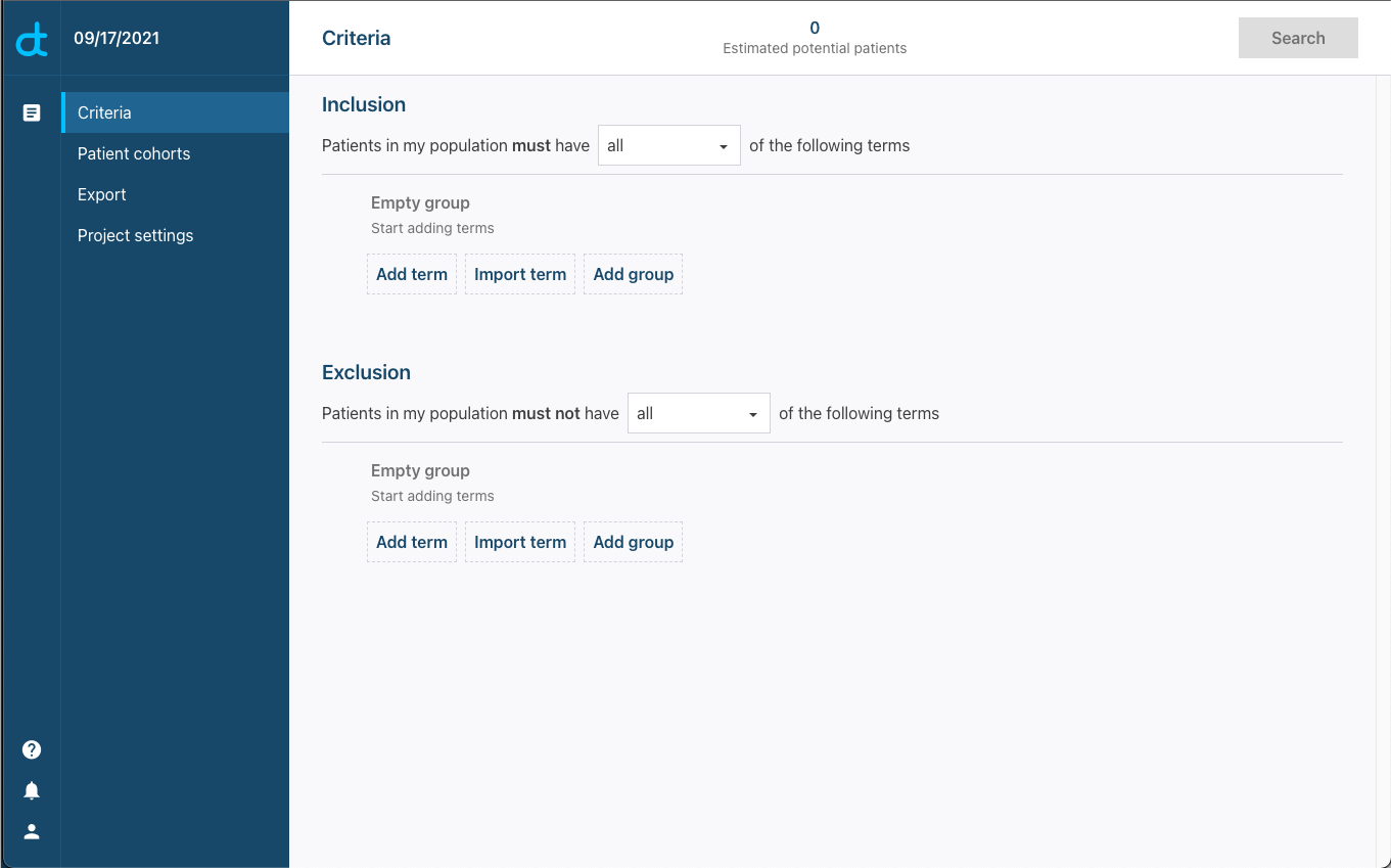
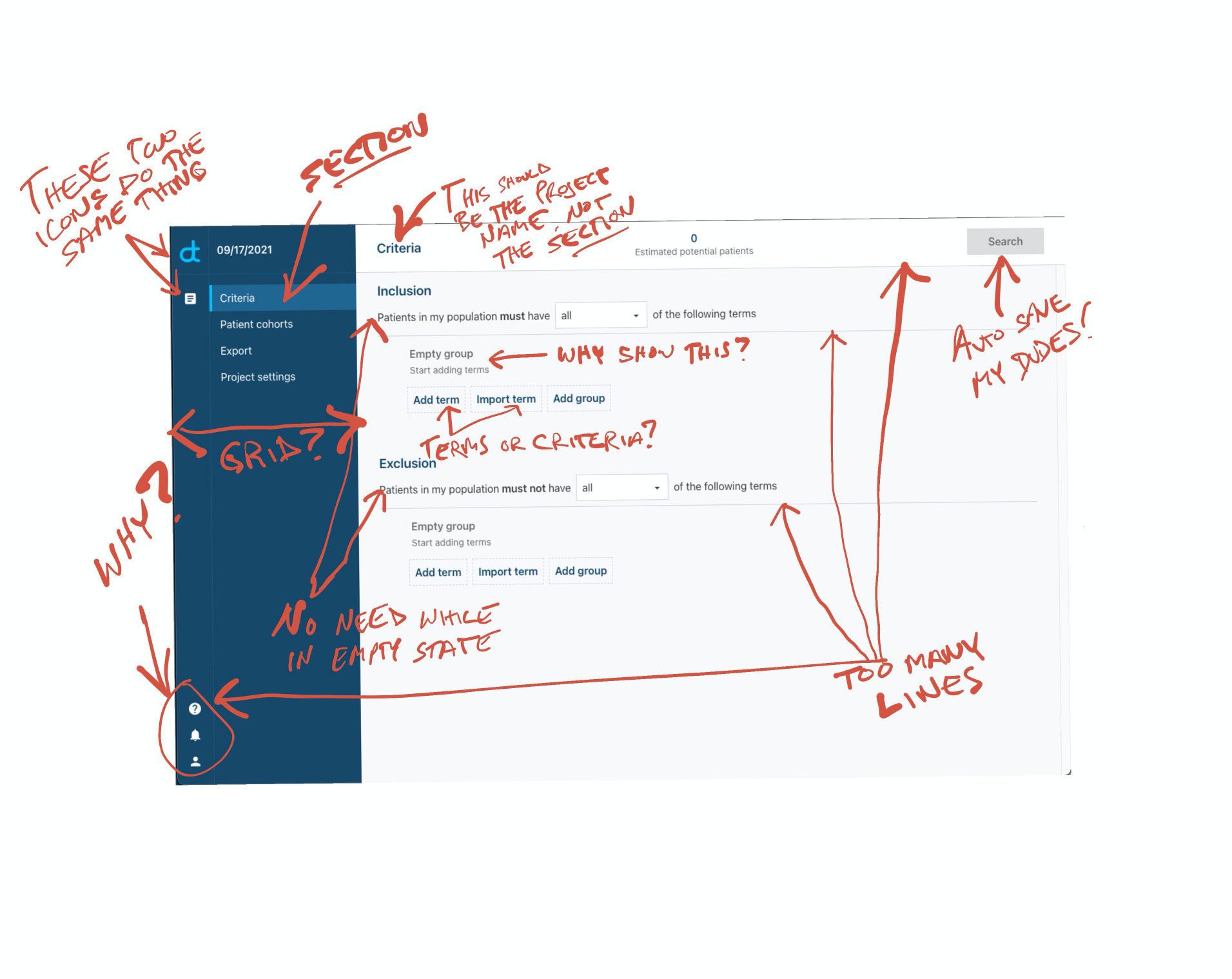
Time to bust out the red pen. You love to see it.
After recommended changes
So far so good! The team is excited to see an optimized user flow, a fresh take on presentation and clean clear intuitive functionality. I’d say buy-in has been achieved.
Kick off officially begins in a few days and myself and the team are prepared for the roadmap ahead.